
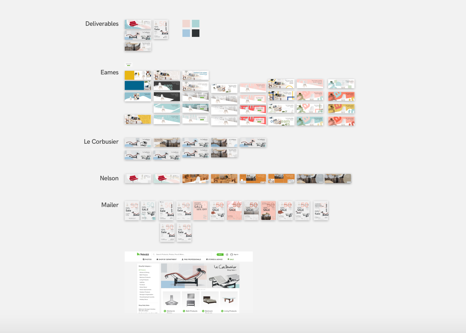
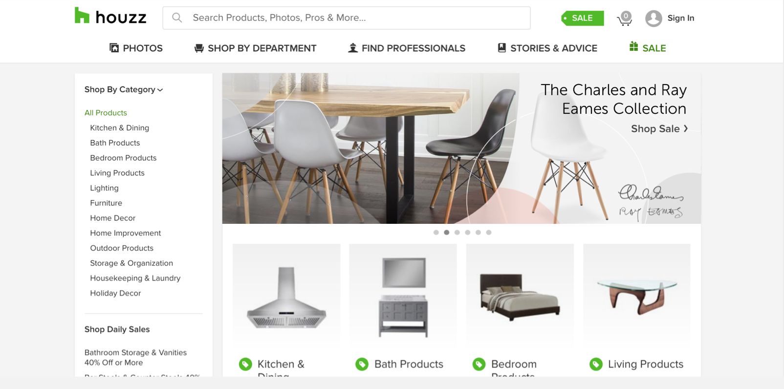


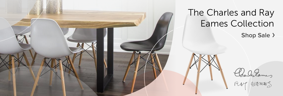
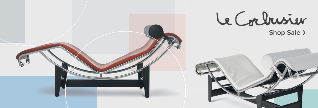
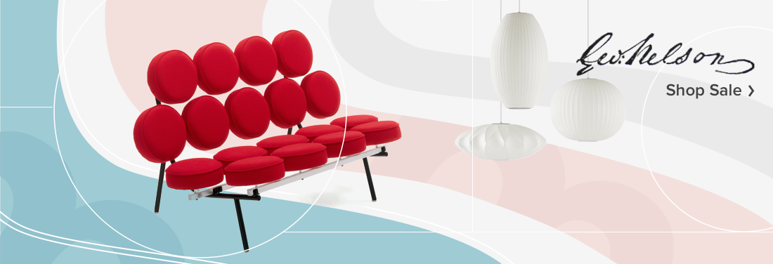
As a case study for Houzz, I created web and print assets for a designer furniture sale marketing campaign. The case study campaign featured furniture by mid-century modern designers like Charles and Ray Eames, Le Corbusier, and George Nelson.
DEFINING THE AUDIENCE
The first step in my process was to outline the audience for the designer sale banners and mailer ad. When we think of designers like Charles and Ray Eames, Le Corbusier, and George Nelson, we think of the pedestal and status in design. I once saw the quote "Are you really a designer if you don't own an Eames chair” which sums up this reverence well.
When we hear “designer”, we associate status, good taste, and class - things that we want our homes to show off. Therefore the experience with this sale’s campaign materials will lean towards luxury. I designed the campaign to represent the respect that we have for the designers’ craft with a polished aesthetic.
GATHERING ASSETS
This is meant to be a short turnaround case, so I focused on finding high resolution isolated product shots of the furniture for consistency.
RESEARCHING FURNITURE FEATURE LAYOUTS
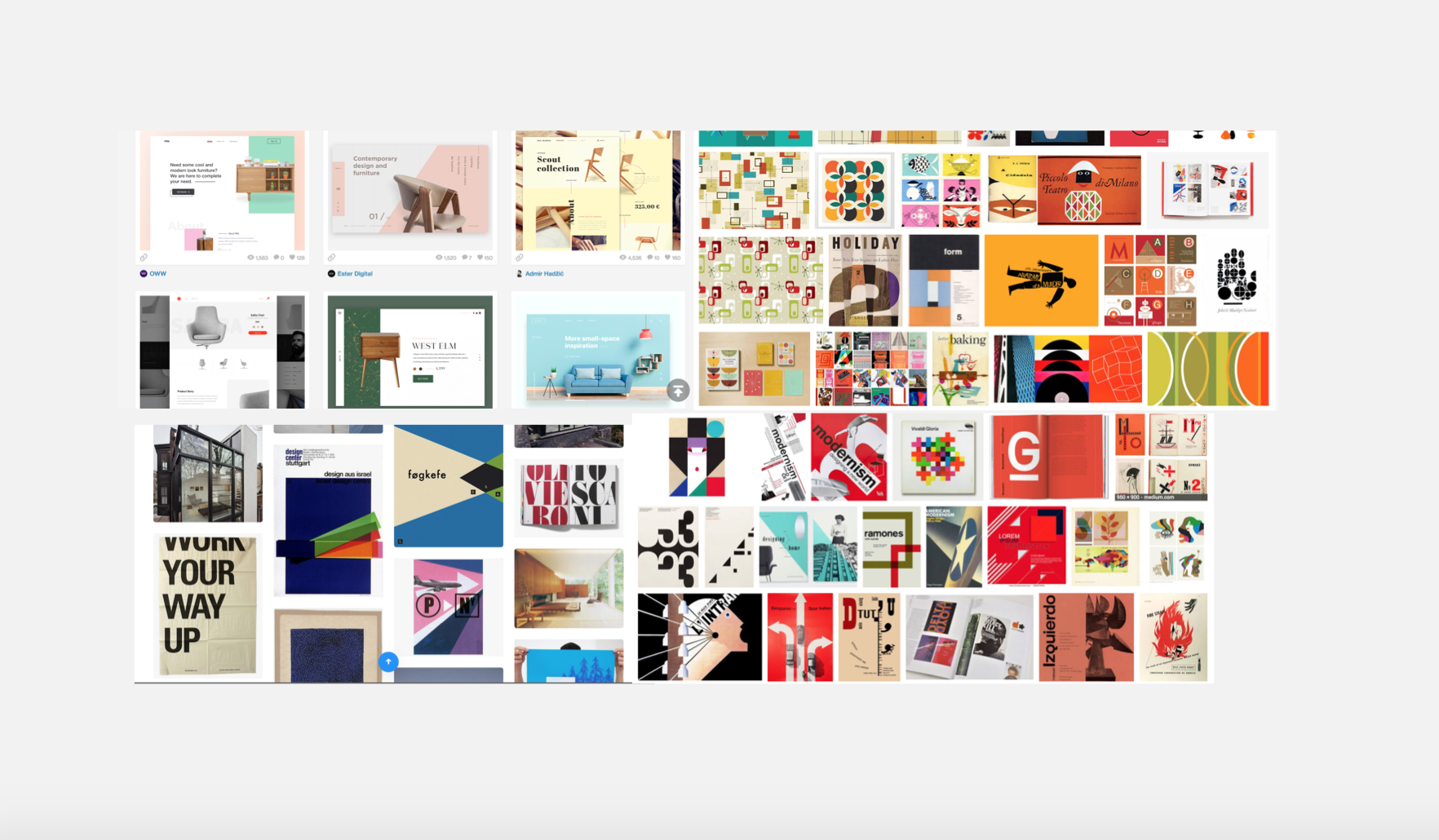
I briefly collected references from sites such as Designspirations, interior design blogs, Houzz content, and Dribbble to get a feel for the approach of other designers in highlighting furniture in layouts.
CHOOSING COLOR PALETTES AND TYPE
I based the color palletes and background graphics loosely on modernist graphic design, but also took into account that this is a summer campaign with the sale taking place in July. I loved the teals often used in modernist design and chose an accompanying salmon and cornflower blue to create a cheerful but not overstated palette that is a bit funky.
I used simple shapes and varying opacities to reinforce the modernist influences but with a clean spin based on the Houzz aesthetic and product page. I’ve included shots of mid-century modern graphic design and product feature layouts that I drew from.
Because I wanted to use the designers’ signatures to give the web banners a personal and dressed up touch, I used the other fonts to reinforce the Houzz brand with Museo Sans and Proxima Nova.
ITERATING LAYOUT SOLUTIONS
I played with this color palettes and background graphic aesthetic in many arrangements working to make sure that the furniture was the star of the banners. I used the shapes to draw attention to certain lines and features of the furniture.
FEEDBACK
I asked a few friends with no context for the case or campaign to talk to me about what the designs felt like, and about what elements the layouts caused them to focus in on. After removing distractions caused by the type/backgrounds that were highlighted and making other changes I laid out the final banners.
PRODUCING FINAL ASSETS
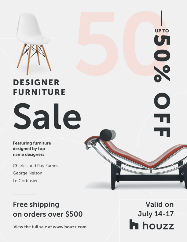
I designed the mailer after completing the web banner set and reinforced the campaign stye with the color palette, overlaid grid and circle line work, and negative space around the furniture in the foreground with a type hierarchy that emphasizes the scale of the sale at up to 50% off.